
Serif or sans serif: which typeface to choose?
For text on a screen and for small type on paper you choose sans serif. For long printed texts a serif is fine, but it is no longer a law. The size and the use decide, not taste.
Last updated: 22 August 2026 · Dave Counotte, print production manager at Vogelaar
What is a serif, actually?
Serifs are the small cross-strokes at the ends of a letter. A letter with those strokes is called a serif. A letter without them is a sans serif: sans is French for without.
That is the whole difference. Everything that follows is about where you use them.
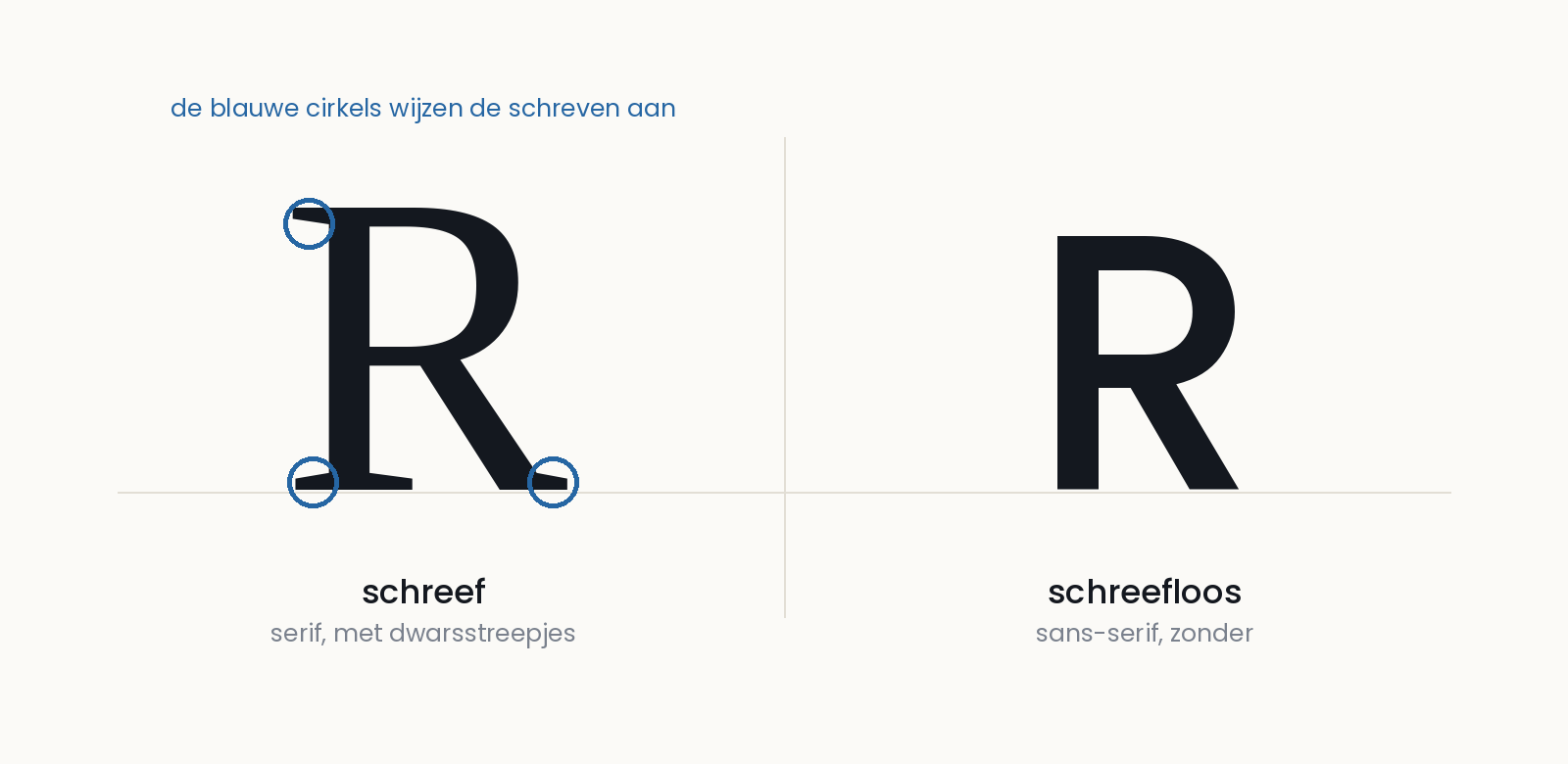
Where does which typeface work?
| Kind | Where it works | Where it goes wrong |
|---|---|---|
| Serif | Long printed texts: books, magazines, annual reports. The serifs guide the eye along the line | Set small, or on a low-resolution screen. The strokes then close up |
| Sans serif | Screens, forms, small type, addressing, anything that is scanned quickly | A long running text in a sans serif that is too heavy becomes a wall |
| Display or script | One headline, a title, an invitation. When atmosphere is the point | In a running text, in an address, or below 10 point. Then it is no longer atmosphere but a reading problem |
The old rule serif for paper, sans serif for screen no longer holds so strictly. Screens have got sharper and long texts in a sans serif are entirely normal. What has stayed: the smaller the type, the more you gain with sans serif.
What we see go wrong in practice
We print and mail every day, and there are three things we keep seeing come back.
A decorative typeface in the address block. The address is read by a machine and by the deliverer. A script or handwriting typeface turns an address into a riddle there. And this is not a matter of taste: PostNL prescribes it.
| PostNL requirement | What it says |
|---|---|
| Typeface | Sans serif. No italics and no blackletter; handwriting faces are often not machine-readable |
| Type size | At least 7 point, at most 17 point, and the whole address in one size |
| Capitals | At 7 to 10 point the address must be in capitals |
| Lines | At least 3, at most 6, left-aligned and parallel to the bottom edge |
| Line spacing | The same throughout, at least 1 mm and at most 5 mm |
Source: PostNL, design conditions, valid from 18 August 2025 (version 2025.v02).
If the address does not meet those, the item may take longer to arrive and extra handling charges may be applied. That is why we are strict about it: it is not our preference, it is the condition under which your mail is processed by machine.
A typeface that does not have all the characters. As soon as we personalise names in a mailing, accents and unusual characters come past: é, ë, ø, ł, ç. If the typeface does not have those, a box appears or the name falls back to another face. You only see that on the press, and by then it is thousands of copies. So test your typeface on the most difficult name in your file, not the easiest.
Too many typefaces in one piece. Three really is the maximum, and two is usually better: one for the headlines, one for the text. Every extra face makes the piece more restless without adding anything.
And for a small mailing?
On a card, a business card or a small-format direct mail, the type is almost always smaller than it looks on your screen. Choose sans serif there, keep the text short, and do not set it lighter than the face can carry.
What else comes into play at a small format, from weight to postage, is on saving on postage.
How to supply it to us
Typefaces do not travel with a file by themselves. So supply your work as a PDF with the fonts embedded, or send the font file with it. If you do not, the text falls back to another face here and the layout no longer holds.
Exactly how to do that is on sending us files. If you are unsure about a choice, send a proof; we will look at it before anything goes on the press.
Want something made or mailed? See what we do at print, or request a quote. We are happy to think about the layout with you, even when the file is already there.
More in Insights
This article belongs to Print. Back to the overview, or carry on with one of these.