
What does your mail item have to meet to be processed by machine?
Requirements for size, weight and rigidity, and requirements for how the address side is laid out. If your mail item does not meet them, the carrier may take longer over it and charge extra handling costs.
Last updated: 22 August 2026 · Dave Counotte, print production manager at Vogelaar
These are the requirements as they stand now.
They come from the PostNL design conditions, version 2025.v02, valid from 18 August 2025, supplemented by the PostNL mail item design checklist of August 2025.
We keep track of when a new version appears and update this page accordingly. The date above says when we last did that. If you want the conditions themselves, we will send them to you.
Why this is more than a question of form
Mail that is processed by machine is cheaper and moves faster. Mail that is not gets taken out and handled by hand.
PostNL says this about it: if a mail item does not meet the conditions, PostNL reserves the right to apply a longer transit time and to charge extra handling costs. That turns a layout rule into a cost, and it is exactly why we look at your file before anything is printed and not after.
Below are the requirements that most often go wrong, for the two forms we mail most: the card and the envelope. Comparable requirements with their own dimensions apply to self-mailers and wrapped mailings.
Size, weight and rigidity
A card falls under format Klein (small) or Groot (large). Anything outside that cannot be processed by machine.
| Klein | Groot | |
|---|---|---|
| Minimum | 140 × 90 mm | 140 × 90 mm |
| Maximum | 229 × 162 mm (C5) | 324 × 229 mm (C4) |
| Maximum thickness | 5 mm | 10 mm |
| Maximum weight | 50 g | 350 g |
| Minimum paper | 170 g/m² | 200 g/m² |
And there is a rigidity requirement many people do not know about. A card has to flex, but not too much: the long side must deflect at least 10 mm under gentle pressure, and may deflect at most 85 mm over a free length of 100 mm. Too floppy jams, and so does too stiff.
The address side must be matt and without a varnish layer. If you do want a finishing layer, put it on the other side.
And for an envelope?
The same size limits, a different material.
| Klein | Groot | |
|---|---|---|
| Minimum | 140 × 90 mm | 140 × 90 mm |
| Maximum | 229 × 162 mm (C5) | 324 × 229 mm (C4) |
| Maximum thickness | 5 mm | 10 mm |
| Maximum weight | 50 g | 350 g |
| Minimum material | 70 g/m² | 70 g/m² |
The envelope has to be flexible enough, and the address zone keeps at least 40 mm from the top and 15 mm from the other sides clear.
If you work with a window, watch three things. The film must be fully transparent, not too glossy and without creases. And most importantly: the address must always be visible, so the contents must not be able to shift inside the envelope. A letter that moves a centimetre in transit turns a good address into an unreadable one.
PostNL does not prescribe a minimum distance from the window to the edges. In practice we do keep space there, because a window close to the edge causes problems when enveloping.
The four zones on the address side
The address side is divided into four areas, and three of them have a fixed place.
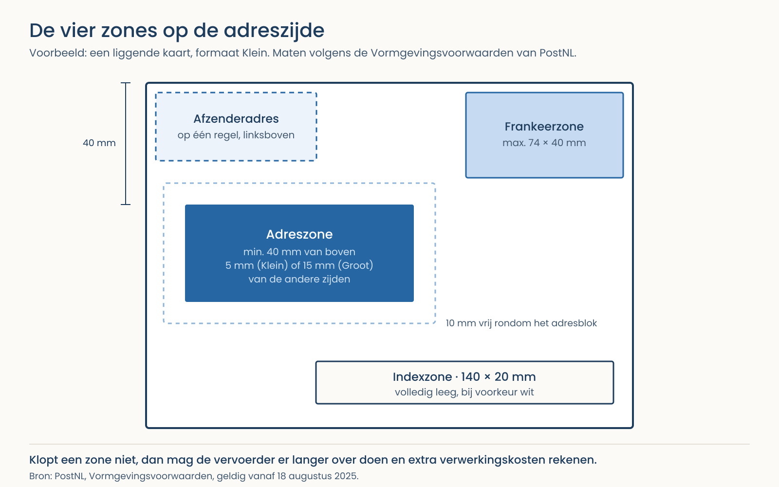
| Zone | Where | What applies |
|---|---|---|
| Franking zone | top right | At most 74 × 40 mm, for the franking or the Port Betaald (postage paid) logo. You may not alter the proportions of that logo |
| Sender address | top left | Size free. Bottom left or on the back is wrong |
| Address zone | centre | At least 40 mm from the top, and 5 mm (Klein) or 15 mm (Groot) from the other sides |
| Index zone | below right of the address | 140 × 20 mm, completely empty and preferably white. This is where the machine puts its own coding |
The index zone is the quiet cost. It looks like dead space, so something often still gets put in it. If that zone is not kept clear, that is precisely one of the cases in which PostNL can charge a longer transit time and extra costs.
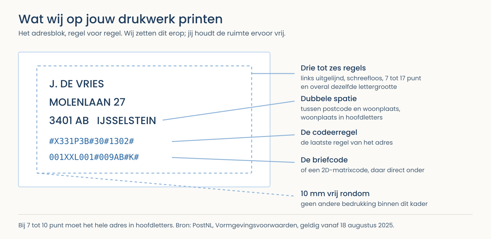
Keep at least 10 mm clear all around the address block from other printing.
The address itself
| Requirement | What it says |
|---|---|
| Typeface | Sans serif. No italics, no blackletter. Handwriting faces are often not machine-readable |
| Type size | At least 7 point, at most 17 point, and the whole address in one size |
| Capitals | At 7 to 10 point the address must be in capitals |
| Lines | At least 3, at most 6, left-aligned and parallel to the bottom edge |
| Line spacing | The same throughout, at least 1 mm and at most 5 mm |
| Order | Name, street, postcode, town. Town in capitals, with a double space between postcode and town |
No underlining, no blank lines in the address, and a t.a.v. line (Dutch for "for the attention of") goes before the second-to-last line.
*And look at what lies under the address. The background the address is printed on has to be as white as possible: the machine reads on contrast. Light lettering on a dark background is not permitted*, and a photo or a block of colour behind the address block is almost always a problem. If you do want colour on the address side, keep it outside the address zone.
The sender address
Every item in a batch has to carry a complete Dutch sender address, and that address has to be genuinely deliverable.
- On one line, top left, preferably underlined so the machine does not sort on it.
- Smaller than the delivery address, and at most 9 point.
- One sender per item. More than one is one of the cases in which extra costs can be charged.
PostNL names four mistakes that occur often: no sender address, a sender address that is not deliverable, the sender address at the bottom left instead of the top left, and a sender address spread over several lines.
The coding under the address
Below the address comes a coding line: a sorting code that differs per address. It is always combined with a letter code or a 2D matrix code, and it should sit visibly with the address block.
You do not have to produce that yourself. We print the coding on it, in the format the machines read best, with the clear space around it that goes with it. What you have to do is keep the place for it free.
Two things we run into ourselves
The examples in the brochure contradict the text. For the portrait card in Klein the drawing says 15 mm while the text prescribes 5 mm. PostNL says these are preferred layouts and that you should get in touch if in doubt. Our advice: go with the more generous measurement. It costs you a few millimetres of design and it prevents an argument.
Not every requirement appears everywhere. The maximum of 9 point for the sender address appears with the envelope and not with the card, while PostNL's separate checklist states it generally. Here too: applying the strictest variant is the cheapest.
Source for all the requirements on this page: PostNL, design conditions, valid from 18 August 2025 (version 2025.v02), and the PostNL mail item design checklist of August 2025. Conditions change; see postnl.nl for the current version. Both documents are in Dutch.
Not sure whether your design will make it? Ask before it goes to the press.
We check for this every day and we know where it goes wrong in practice. A design that passes by us beforehand costs a few minutes. A run that has to be handled by hand afterwards costs money and time. That is exactly the difference this page is trying to prevent.
If you want to read the conditions yourself, we will send them to you. How to supply a file securely is on sending us files, what we do in direct mail is on direct mail, and what the terms mean is in the glossary.
More in Insights
This article belongs to Direct mail. Back to the overview, or carry on with one of these.